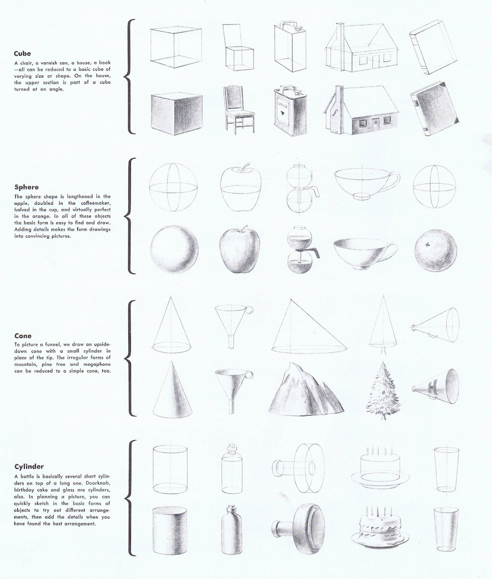
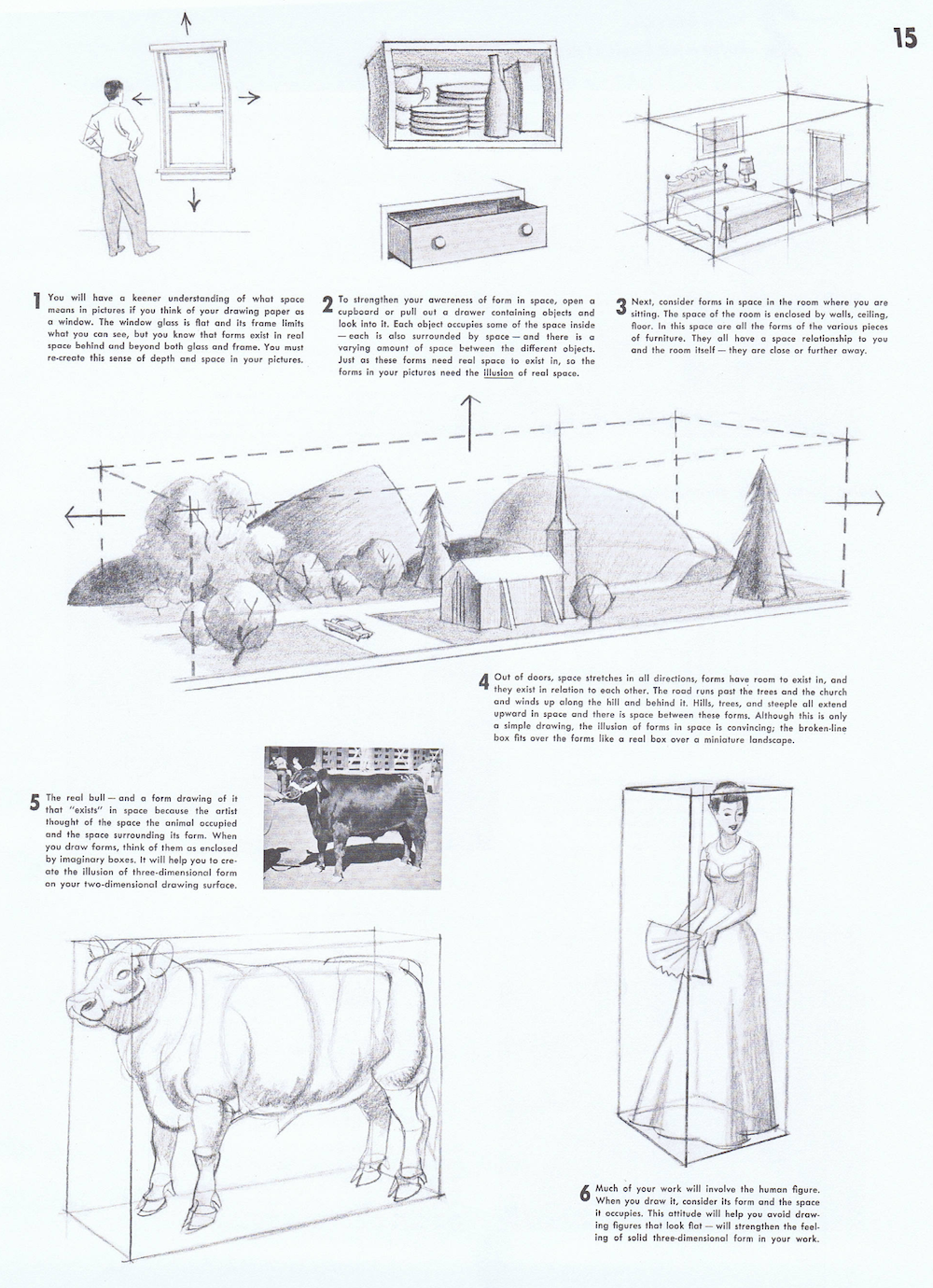
A Simple Guide to Camera Secrets
When you watch a movie, the camera is doing a lot more than just recording the actors. It’s actually telling the story alongside them. By changing how close the camera is, what angle it's at, or what lens is being used, a director can change your mood without you even realizing it. Here is a breakdown of the basic tools filmmakers use to pull you into the story. Today We’ll be looking at Camera Distance, Camera Angle, and Camera Lens.
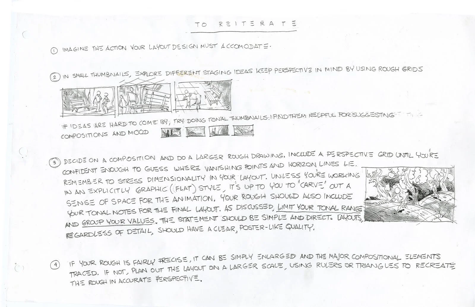
Finding the Right Distance
Mateu-Mestre, Marcos. Framed Ink: Drawing and Composition for Visual Storytellers. Design Studio Press, 2010. https://amzn.to/4rilAAp
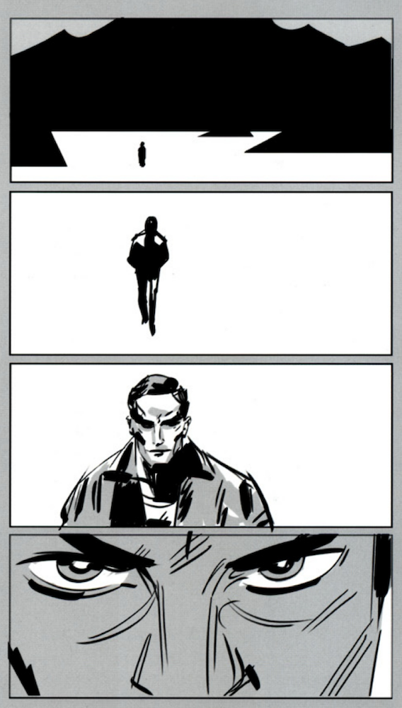
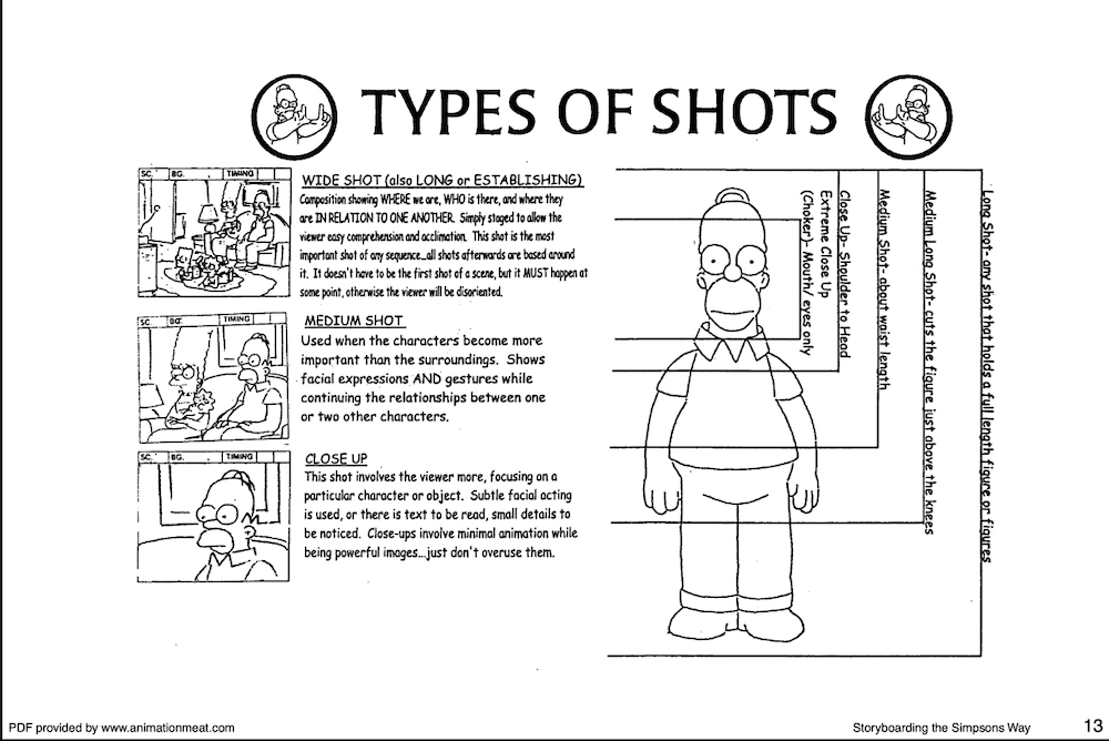
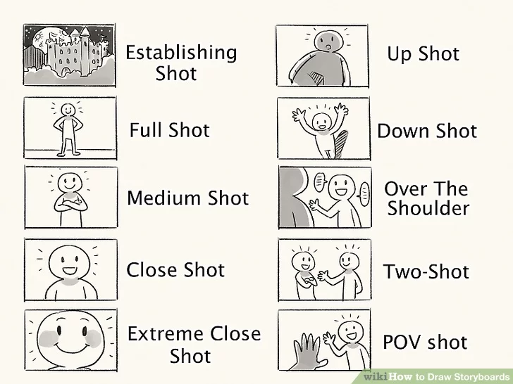
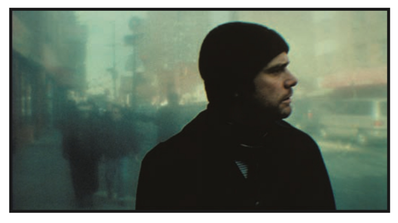
The distance of a shot tells you how to feel about a character’s situation. A Long Shot shows the whole body and the surrounding area. Think of a cowboy, Jean Giraud’s Blueberry, riding across a massive desert. It’s used to show how big the world is and how small the character feels. As the camera moves in for a Medium Shot (waist-up), the focus shifts to the conversation. This is the "comfort zone" of a movie, where most of the talking happens. When things get intense, the camera moves into a Close-Up, focusing only on the face. This is where you see the sweat on a hero's brow or the tears in a character's eyes, forcing you to feel exactly what they feel.
StoryBoarding the Simpsons way- http://Animationmeat.com
Using Angles to Show Power
The height of the camera tells the audience who is in charge. If the camera is at Eye-Level, you feel like you’re just a person standing in the room. But if the camera looks up from a Low Angle, the person on screen looks huge and powerful. This is how directors make superheroes look legendary or villains look scary. On the flip side, a High Angle looks down at a character, making them look weak or trapped. For something more extreme, a Bird’s Eye View looks straight down from the sky to show a whole city or a crime scene, while a Dutch Tilt (tilting the camera to the side) makes the world look crooked and "off," usually to show that a character is losing their mind or in danger.
“Comic Strip Artist’s Kit (Redux).” Temple of the Seven Golden Camels, 2006, http://sevencamels.blogspot.com/2006/09/comic-strip-artists-kit-redux.html.
“Comic Strip Artist’s Kit (Redux).” Temple of the Seven Golden Camels, 2006, http://sevencamels.blogspot.com/2006/09/comic-strip-artists-kit-redux.html.
How Lenses Change the World
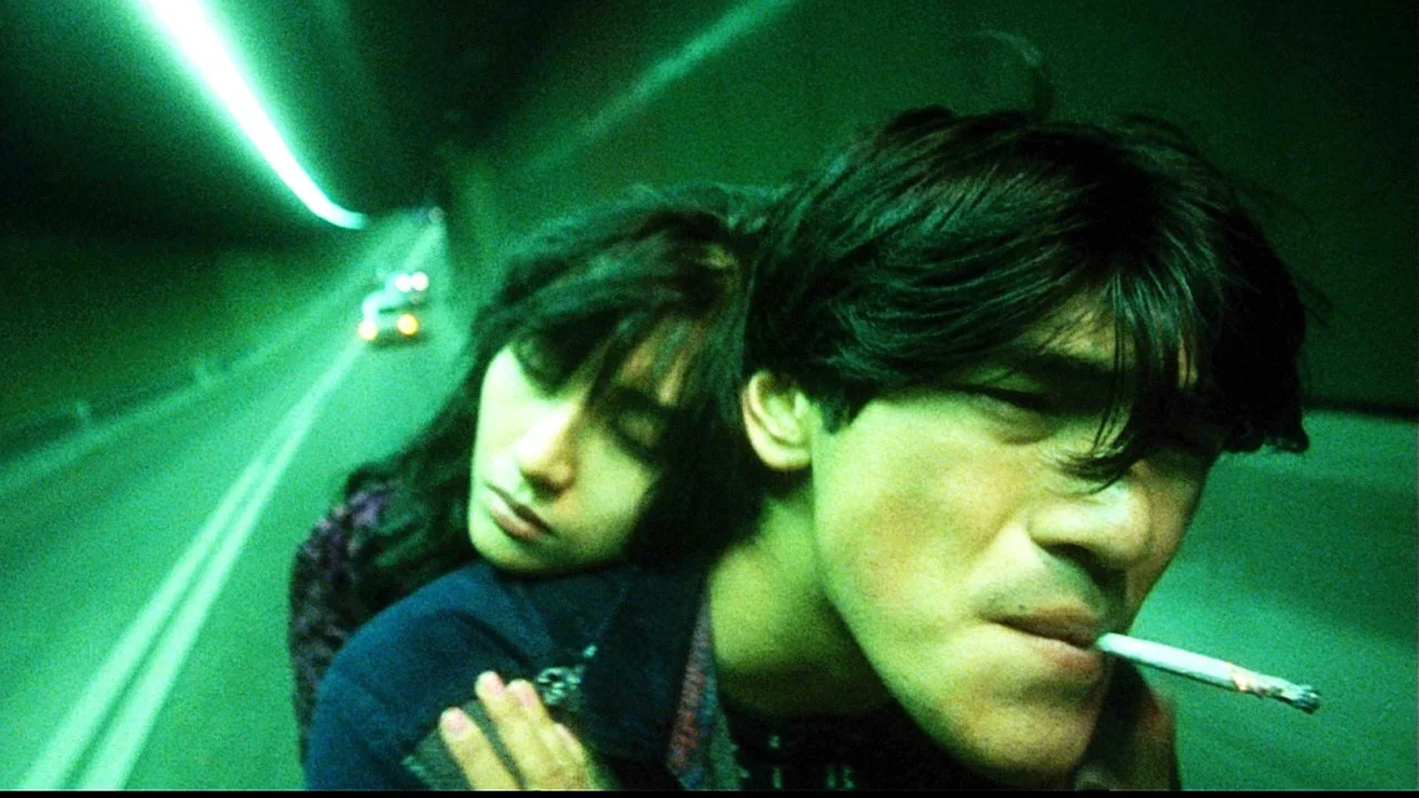
Wong Kar-wai’s Fallen Angels. Wong Kar-Wai uses the wide angle lens in unique and creative ways. https://amzn.to/4avOmpL
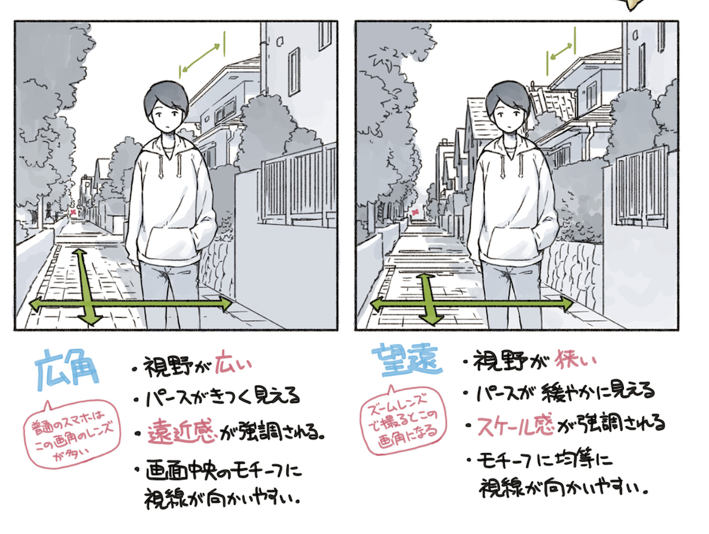
Different glass lenses change how we see space and distance. A Wide-Angle Lens sees a lot of the room at once but can make things look slightly stretched out. It’s great for a high-speed car chase or showing off a beautiful castle.
If you go even wider with a Fisheye Lens, the edges of the screen start to curve like a ball, which creates a trippy, distorted look often used in music videos or dream scenes.
On the other hand, a Telephoto Lens acts like a telescope. it zooms in on a subject and "squished" everything together the person. This removes a lot of the distortion that happens in the wide angles lens. This is why fashion photography uses more telephoto lenses.
Yoshida, Seiji. TIPS! 絵が描きたくなるヒント集〈ダウンロード特典あり〉 [Tips! Hints to Make You Want to Draw]. MdN Corporation, 2023. https://amzn.to/4kEasv2
Page, Travis. “3 Ways to Draw Storyboards.” wikiHow, 24 Feb. 2025, www.wikihow.com/Draw-Storyboards. Fantastic reference to start thing about shots.
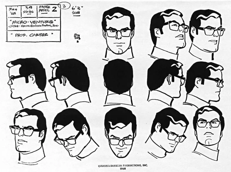
Character Turnarounds
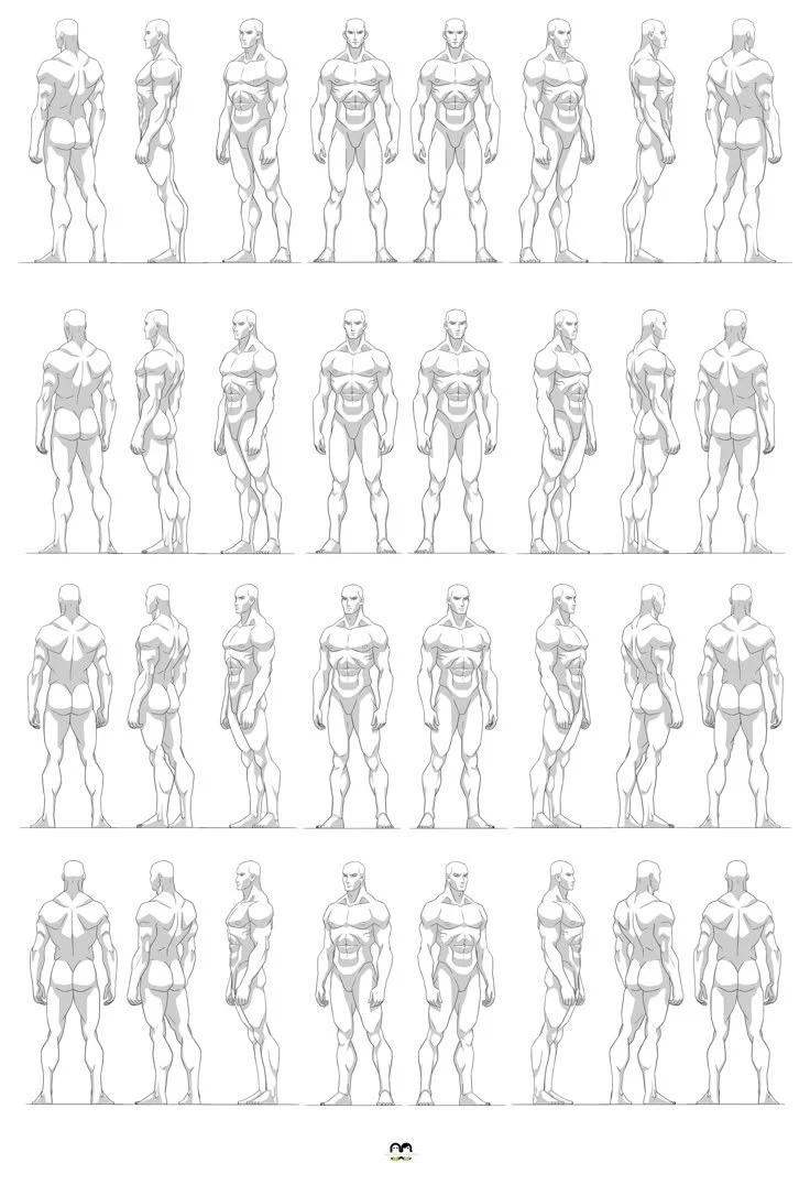
In the world of animation and game design, a single drawing is rarely enough to bring a character to life. Whether you are working on a high-budget feature film or an indie 2D platformer, your characters need to exist in a three-dimensional world. This is where the turnaround comes in. Also known as a rotation or a model sheet, a turnaround is a collection of drawings that depict a character from various angles.
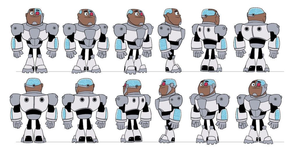
Subject: Cyborg Character Turnaround Model Sheet Studio: Warner Bros. Animation / DC Entertainment Chris Battle credited as a character designer on the show
Think of the turnaround as a visual blueprint. Its primary purpose is to maintain consistency. When a character moves from one artist to another, or from a concept sketch to a 3D model, the turnaround ensures that every detail remains on model. It teaches the team how the character’s volume, proportions, and unique features behave as they rotate through space.
Choosing Your Views
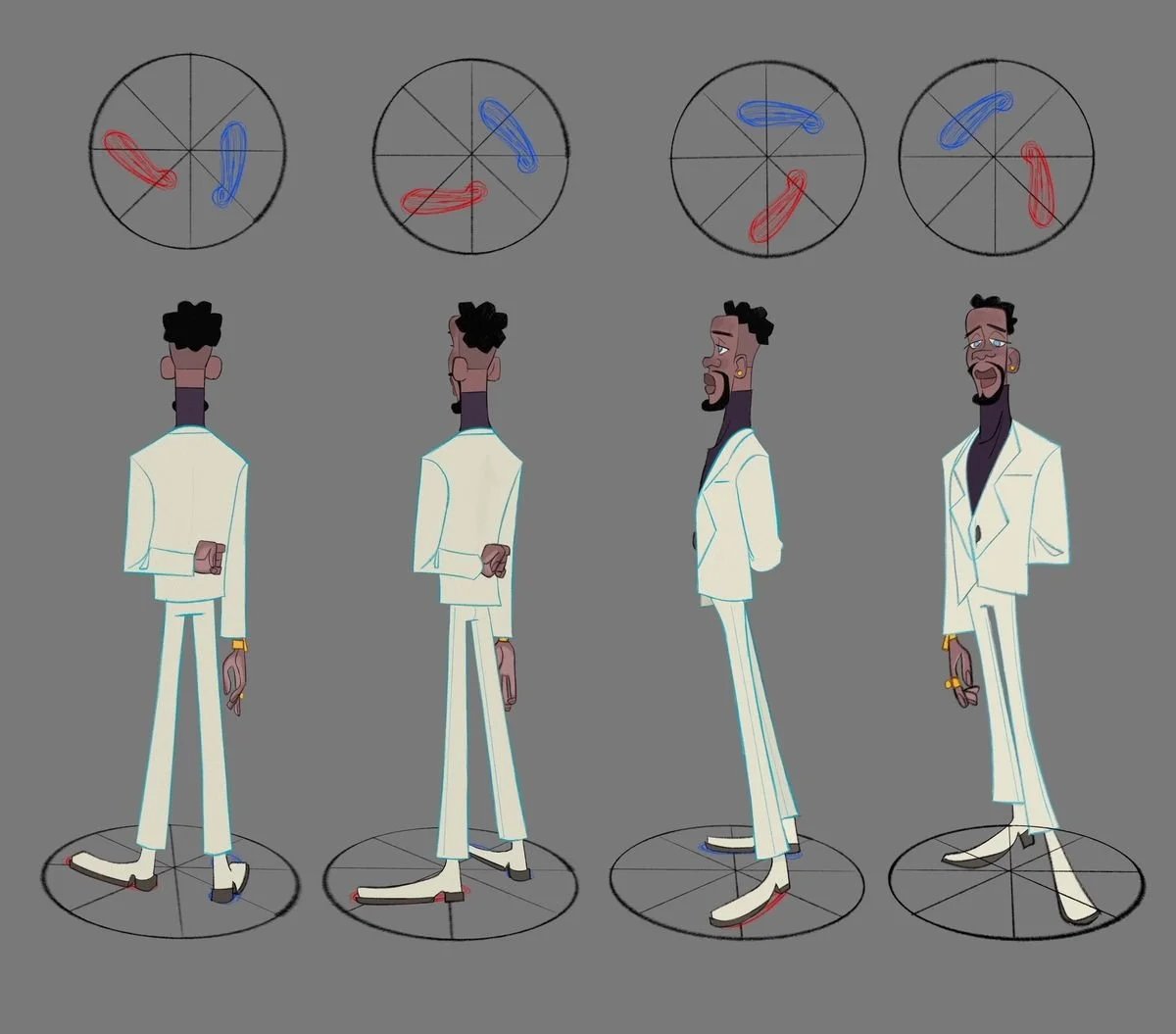
The number of angles you need to draw depends largely on the requirements of your project. A four point turn is often the baseline for most productions. This typically includes a front view, a three quarter front view, a side profile, and a three quarter back view. If you are working toward an industry standard, you will likely produce a five point turn which adds a direct back view to that list.
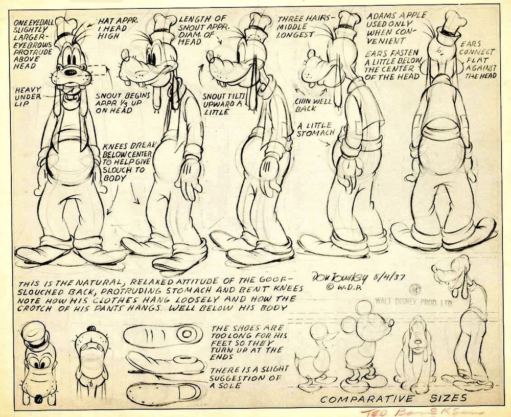
Artist: Don Towsley Title: Character Model Sheet for Goofy (The Goof) Date: August 4, 1937
For complex characters or asymmetrical designs, studios might require eight or more views. These extra angles help smooth out the rotation and prevent any awkward jumps in the design. In these high-end productions, you might even draw off-center views like the five-eighths or seven-eighths angles. 3D pipelines introduce even more specific needs. Artists often produce a T-pose with arms stretched horizontally for rigging, or an A-pose with arms angled down for a more natural shoulder deformation.
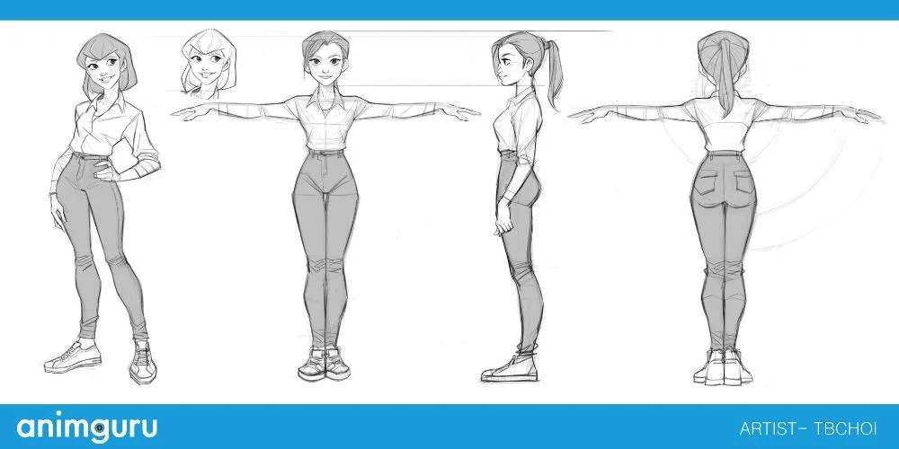
T Pose by TB CHOI-https://www.artstation.com/artwork/baR6Vr
The Step-by-Step Creation Process
To create a successful turnaround, you must rely on technical precision. The most vital tool in your arsenal is the guideline. By drawing horizontal lines across your canvas or using your digitals guidelines capabilities, you can align key landmarks such as the top of the head, the eyes, the nose, the shoulders, and the feet. Using different colors for these lines can help you avoid confusion as the page gets busier.
Masters of ANATOMY- https://www.mastersofanatomy.com/ This is a helpful reference for a basic character turn around
The workflow begins with the front view. This acts as the anchor and the ruler for the entire sheet. Once the front view is established, you move into the three quarter and profile views. This is where the illusion of depth is born. In a three quarter view, the far side of the body undergoes foreshortening, appearing narrower than the side closer to the viewer. When you reach the side profile, you finally reveal the true curve of the spine and the shape of the nose.
Artist: Krenz Cushart Title: How to Draw Human Body in Perspective (About Perspective Vol. 1) https://krenzcushart.gumroad.com/
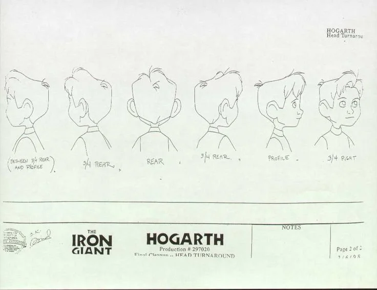
Title: Hogarth Head Turnaround (Production #297020) Production: The Iron Giant Date: February 6, 1998 Publisher/Studio: Warner Bros. Feature Animation
Technical Rules and Industry Cheats
Character design is rarely about geometric perfection. In 2D animation, artists often utilize a technique known as the cheat. This means you draw what looks most appealing from a specific angle rather than what is mathematically correct. A classic example is Mickey Mouse, whose ears are almost always drawn facing the camera to preserve his iconic silhouette.
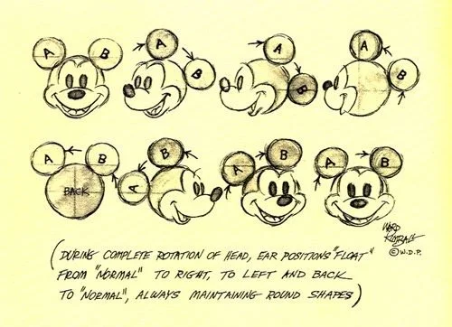
Artist: Ward Kimball Title: Mickey Mouse Ear Rotation Guide Publisher/Studio: Walt Disney Productions (© W.D.P.) Subject: Character Construction and Silhouette Consistency
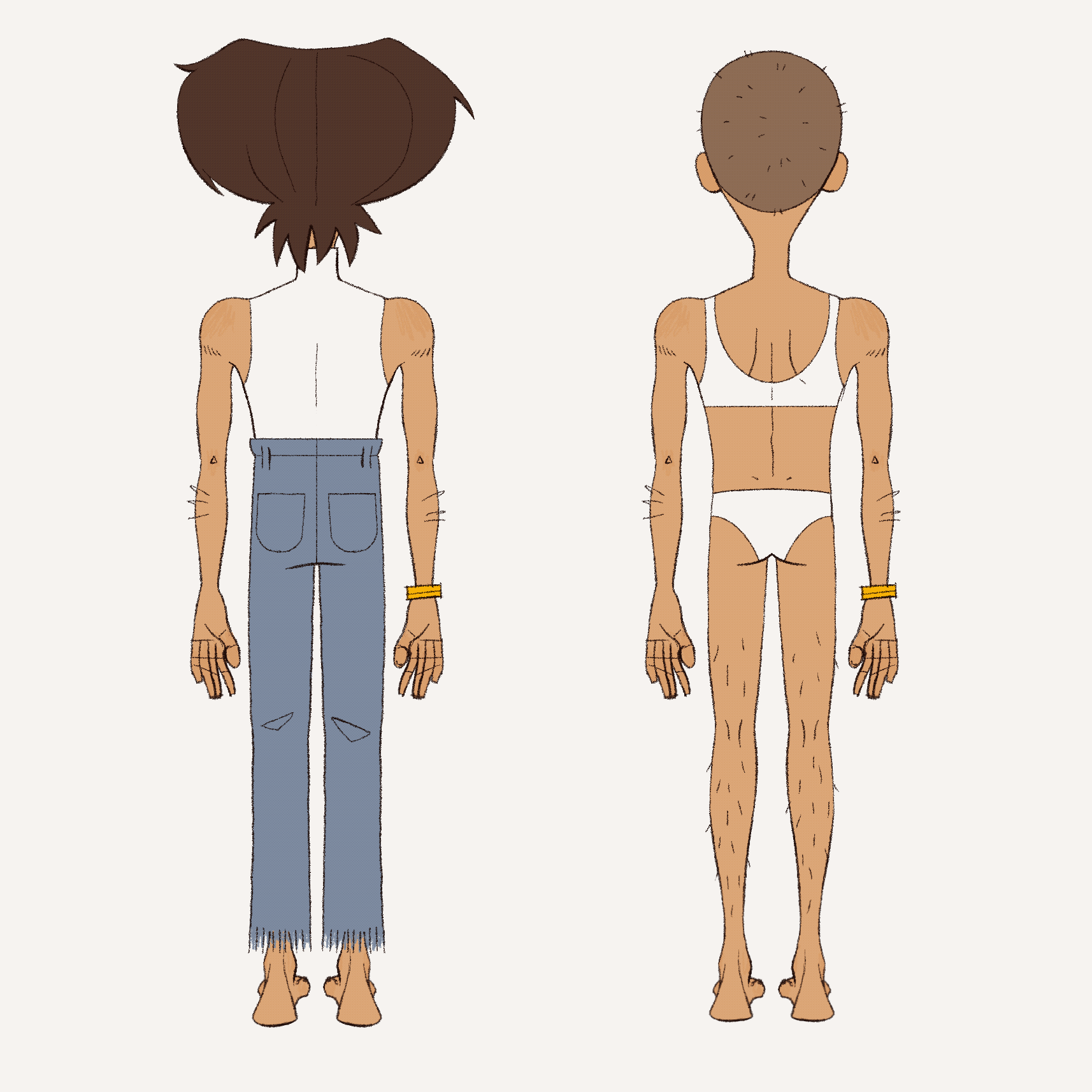
However, some rules remain strict. You cannot simply flip a three quarter front drawing to create a three quarter back view. Because of the curve of the spine and the tilt of the pelvis, the silhouettes do not perfectly match. You must adjust the posture and the belt line to reflect the anatomy accurately. For television productions, you might even need to design a distance model. This is a simplified version of the character with fewer details, such as removing shoelaces or simplifying eyes, specifically for shots where the character is far away from the camera.
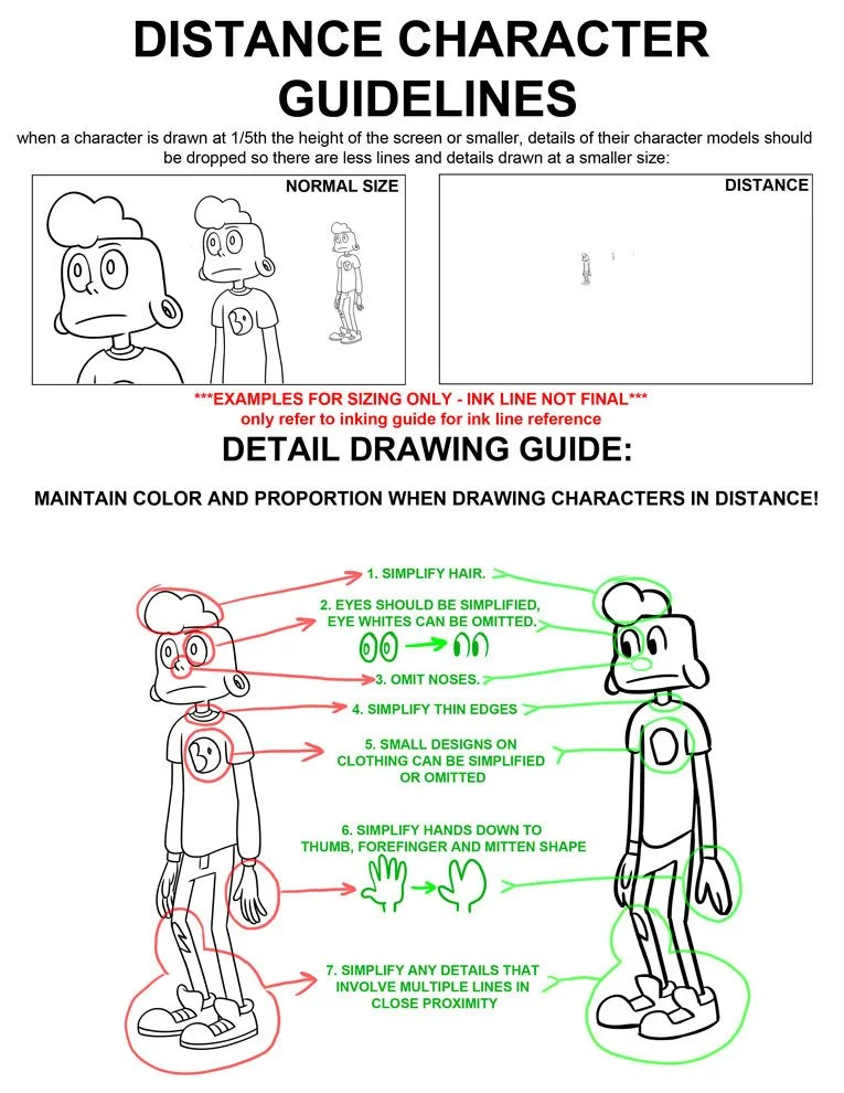
Steven Crewniverse. "What is a distance model? When a character is going to be very small on screen, their design is simplified so that it doesn’t look messy!" Tumblr, 13 Mar. 2014, stevencrewniverse.tumblr.com/post/80083383616/what-is-a-distance-model-when-a-character-is.
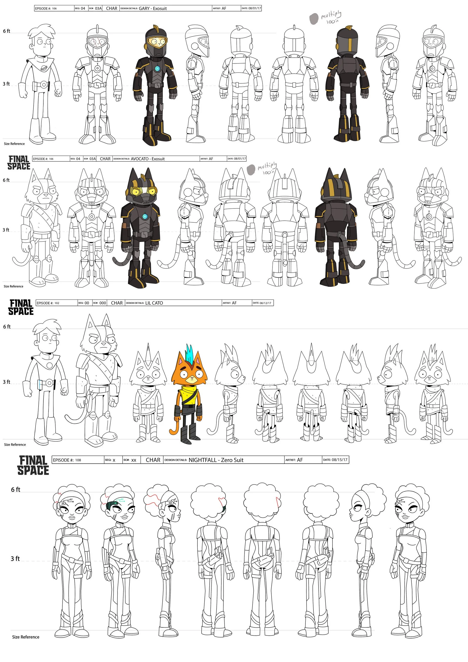
FINAL SPACE CHARACTER TURNAROUND BY ADAM FAY- https://www.artstation.com/artwork/Lq6LA
Refining the Rotation
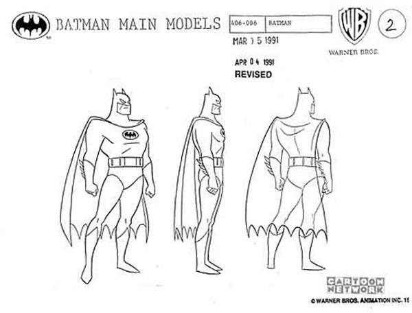
Artist: Unknown Possibly Bruce Timm (Warner Bros. Animation Department) Title: Batman Main Models (Model #406-006) Production: Batman: The Animated Series
The final stage of the process involves the back view and the cleanup. The back view often starts with a silhouette transfer from the front view to ensure the height remains identical. This is the time to account for draw-throughs. If the character has a cape, long hair, or a skirt, you must sketch the anatomy hidden underneath so the animator understands how the body moves behind the clothing.
Artist: Rudy Hill Title: character turnaround https://www.artstation.com/artwork/dKOwO1
As you move from rough sketches to final tiedowns, focus on maintaining a consistent line weight. A common trick to check your work is to flip the canvas horizontally. This mirror method instantly highlights if your character is leaning too far to one side or if the perspective is off. By the time you reach the final ink stage, your character should feel like a solid, tangible object that is ready to move.
Artist: Anya Butler (MEPPiTY) Title: Eddie Turnaround Project: FIREWORKS (Upcoming Film) Website: https://www.meppity.com/character-design
Helpful Video Tutorials!
Again BAM has some of the best videos!
Character acting
Acting for Characters: The Art of the Performance
In professional animation, a character is far more than a cool drawing. It is a set of blueprints that allows a team to speak the same visual language. To move from being an illustrator to a character designer, you must master the art of the model sheet. Character design is about performance: moving a character from a static concept to a living, breathing entity through whole-body acting and facial mechanics. Whether you are prepping a model pack for production or building a portfolio, your goal is to make the audience understand a character’s personality in a single second.
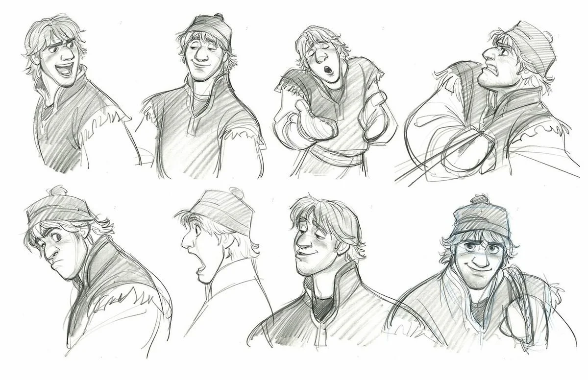
Expression sheet of Kristoff from Disney’s Frozen and was drawn by Jin Kim
The Masking Effect: Why We Connect with Lines
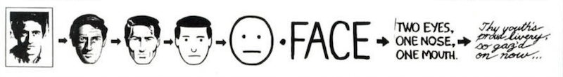
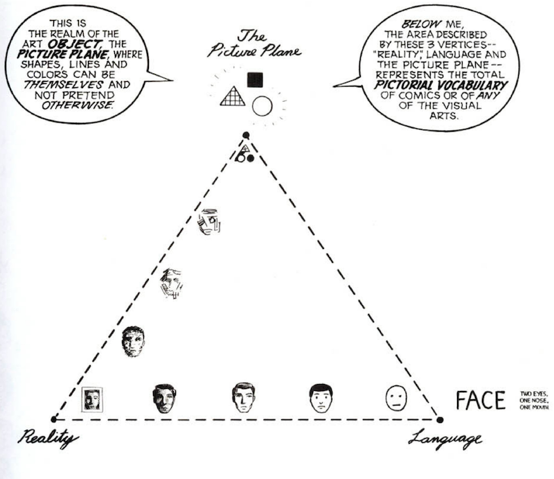
Why is it that we often feel a deeper emotional connection to a simple circle with two dots for eyes than we do to a hyper-realistic 3D render? This phenomenon is known as the Masking Effect, a concept popularized by theorist Scott McCloud. He argues that the further we move away from realism toward abstraction, the more easily the audience can project themselves onto the character.
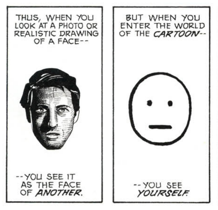
As Scott McCloud points out in Understanding Comics, the more 'cartoony' a face is, the more people it could be. He calls this the Masking Effect. By simplifying the features of our protagonist into an icon, we create a vacuum into which the viewer pours their own identity. McCloud, Scott. Understanding Comics: The Invisible Art. HarperPerennial, 1993. https://amzn.to/3NNEsZ8
Understanding Comics: The Invisible Art. HarperPerennial, 1993. https://amzn.to/3NNEsZ8
A realistic face is the face of a stranger. Someone specific with their own features and history. However, a simplified, iconic face is a "mask" that anyone can wear. By stripping away the distracting details of skin texture, pores, and individual anatomy, we allow the viewer to focus entirely on the emotional intent. This simplicity creates a vacuum that the audience fills with their own identity and empathy.
Understanding Comics: The Invisible Art. HarperPerennial, 1993. https://amzn.to/3NNEsZ8
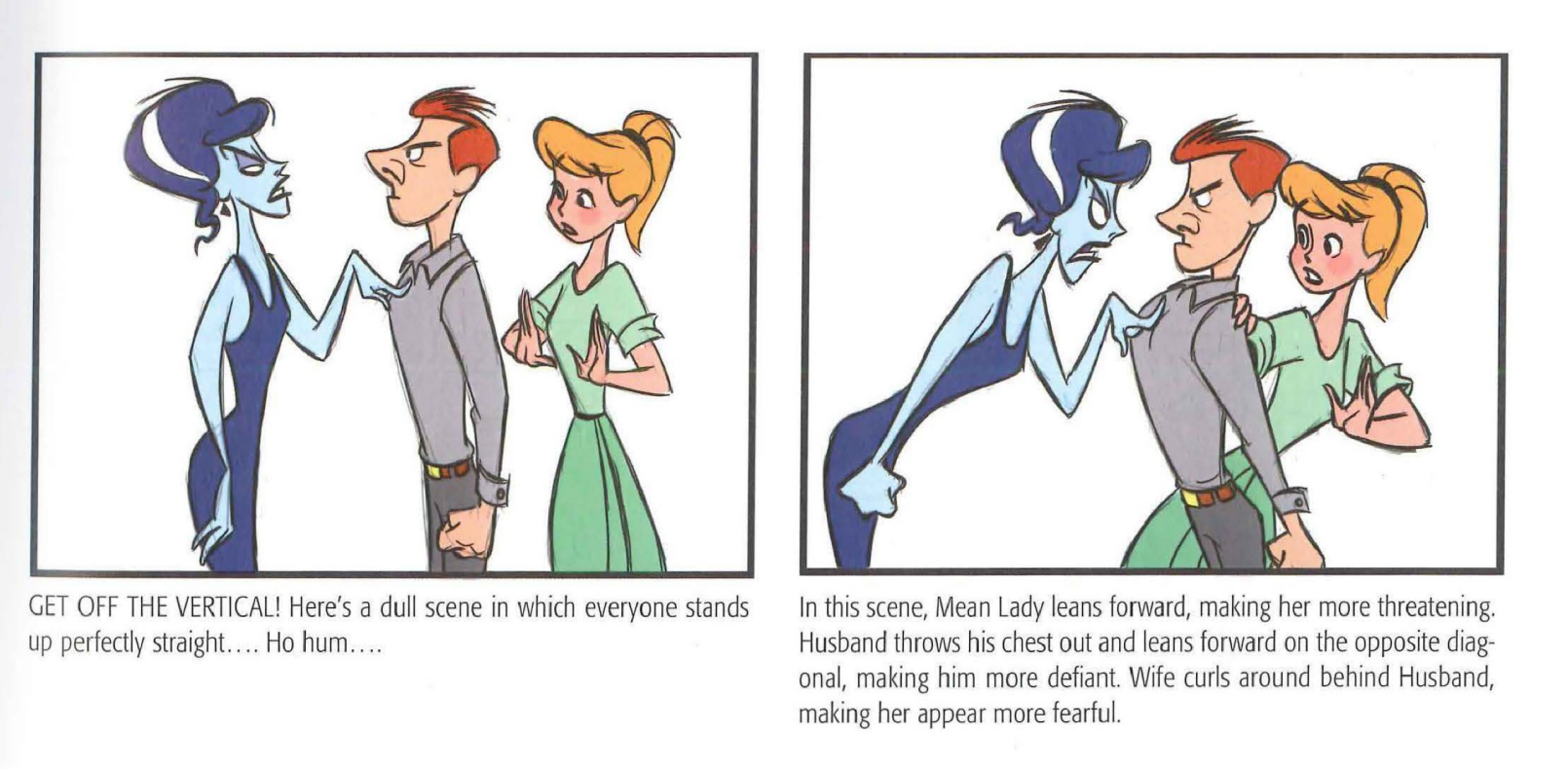
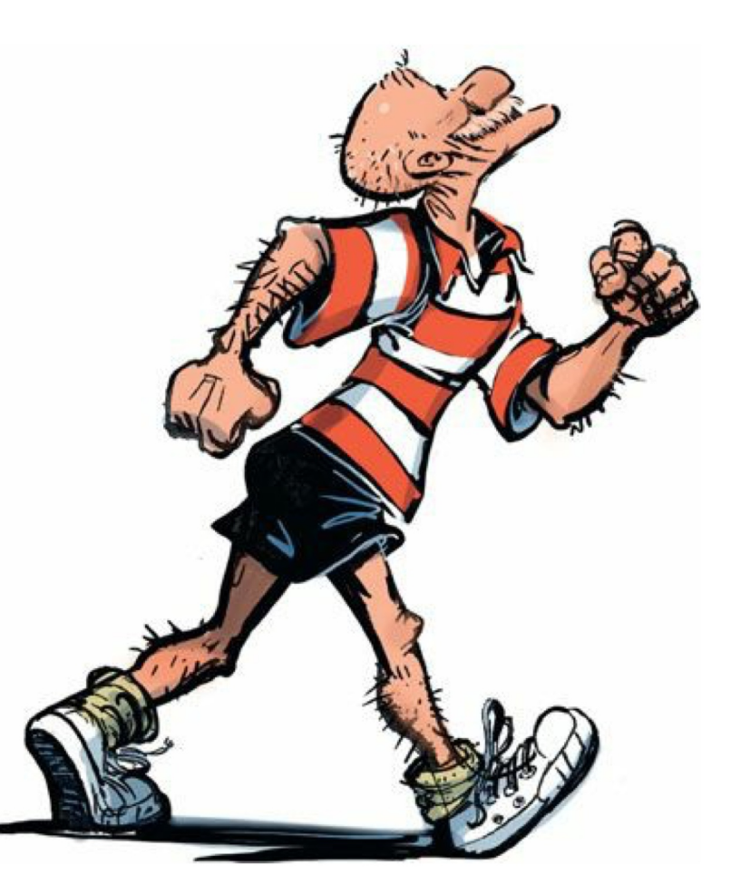
The Foundation of a Pose: Dynamic Energy
Every dynamic drawing begins with the Line of Action. This is a single, sweeping curve that defines the energy of the movement. Stiff, straight lines are the enemy of appeal. Instead, use fluid C-curves and S-curves to establish a rhythm and prevent the stiffness that plagues amateur designs. These curves provide a clear direction for the drawing’s energy, making the action readable at a glance.
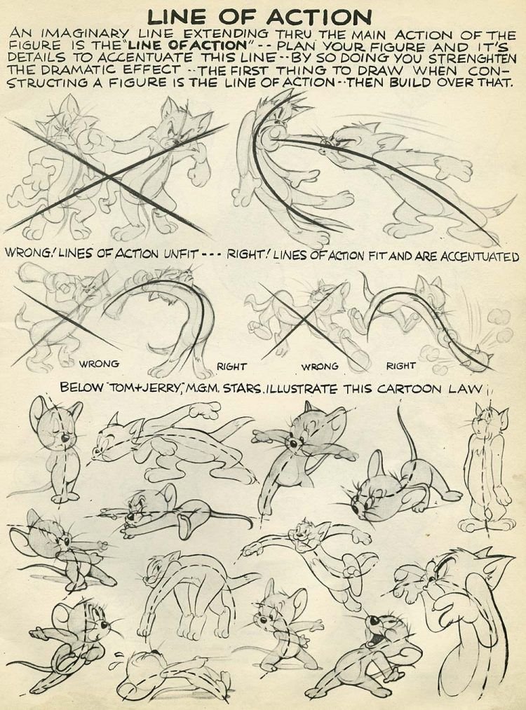
Blair, P. (1994). Cartoon animation. Walter Foster Publishing. https://amzn.to/4r1ZsK8
Once the energy is set, you must verify the silhouette. The fundamental test of a good pose is its readability; if you were to fill the character in with solid black, the action and intent should still be perfectly clear. If the silhouette is a muddy, tangled blob, you must adjust the negative space. Creating clear gaps between limbs and the torso ensures the viewer instantly recognizes the character's behavior.
Mechanics and Body Psychology
To avoid a "cardboard" look, artists use contrapposto, the principle of tilt and twist. In a natural stance, the angle of the shoulders should contrast with the angle of the hips. If the left shoulder is raised, the left hip usually drops to counterbalance the weight. This relationship creates a sense of gravity and stability that makes the character feel physically present on the ground.
Comic Strip Artist’s Kit By Carson Van Osten- https://sevencamels.blogspot.com/2006/09/comic-strip-artists-kit-redux.html
Body language serves as visual shorthand for a character's inner state. Poses must prioritize storytelling, as every gesture is a deliberate choice that reinforces the character's core. A confident hero occupies more space with an open posture and an exposed chest. Conversely, a fearful or shy character might instinctively protect their "vital organs" by slouching or crossing their arms. Small details—like how a character pushes up their glasses or holds a tool—often tell more about their history than a page of dialogue.
Goldberg teaches that every pose should have a clear "attitude." Whether the character is arrogant, shy, or excited, the entire body—not just the face—must broadcast that specific trait through the Line of Action. Goldberg, E. (2008). Character animation crash course!. Silman-James Press. https://amzn.to/4kfWWxE
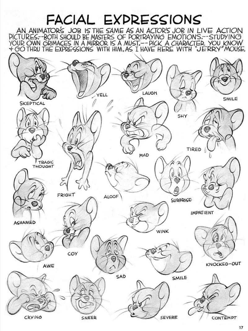
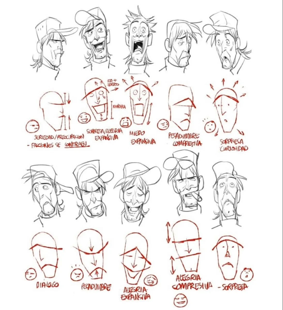
The Language of Emotion: Mastering Expressions
Goldberg, E. (2008). Character animation crash course!. Silman-James Press. https://amzn.to/4kfWWxE
An expression sheet is the soul of your design. Its primary purpose is to show animators how a character’s personality manifests through their features. A professional sheet avoids repetitive faces by showcasing a wide range of emotional intensity. You should include extreme reactions where the face undergoes significant squash and stretch alongside subtle, quiet moments.
Blair, P. (1994). Cartoon animation. Walter Foster Publishing. https://amzn.to/4r1ZsK8
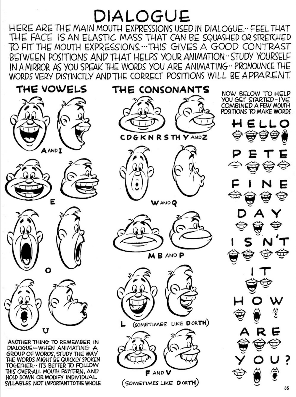
To keep the face looking organic, utilize asymmetry. Offsetting the eyebrows or the corners of the mouth prevents the drawing from looking like a mirrored plastic model. Keep the eyes as the focal point, as they are the most direct indicator of intent. For speaking characters, a mouth chart is a vital technical requirement. This consists of eight to fourteen key positions for standard phonemes like A, E, O, and M. A sophisticated designer creates two sets of mouth shapes: one for happy or neutral dialogue and another for angry or sad contexts to ensure the lip-sync matches the emotional weight of the performance.
Blair, P. (1994). Cartoon animation. Walter Foster Publishing. https://amzn.to/4r1ZsK8
Step One: Research, Shape Language, and the Line-Up
The professional workflow begins in the exploration phase, often called the "blob phase" because the focus is on large, simple shapes rather than fine detail. Last week, you utilized this process to develop your initial character line-up. By focusing on distinct shape language, you ensured each character is recognizable by silhouette alone. This foundational step is critical for maintaining "readability" across a production.
Goldberg, E. (2008). Character animation crash course!. Silman-James Press. https://amzn.to/4kfWWxE
When you worked on that line-up, you used the three-section method—varying the proportions of the head, torso, and legs to avoid "default" anatomy. This week, your challenge is to maintain that specific shape language while moving into the acting stage. You are visually rehearsing how those specific shapes move. A character built of sturdy, square shapes moves with a different center of gravity than one built of sharp, triangular shapes. Your thumbnails should be small, loose sketches that prioritize energy while strictly honoring the proportions you established in your line-up.
Blair, P. (1994). Cartoon animation. Walter Foster Publishing. https://amzn.to/4r1ZsK8
Step Two: The Acting Sheet and Performance
Now you must put the character through their paces. Start with loose gesture drawings to capture flow. Do not worry about perfect anatomy yet! Focus on the performance. Your goal is to select four or five key poses that define the character's range. This should include:
“DRAW VERBS!” Stanchfield, Walt. Drawn to Life: 20 Golden Years of Disney Master Classes: Volume 1: The Walt Stanchfield Lectures. Edited by Don Hahn, Focal Press, 2023.https://amzn.to/3NNjIkc
An Action Pose (running, jumping, or fighting).
A Personality Pose (slouching, leaning, or a signature gesture).
An Interaction Pose (handling a prop or tool).
Pablos, Sergio. Facial Expressions and Mechanics Study. SPA Studios Animation Training, SPA Studios.
Once the gestures are selected, move into the tie-down phase. This is where you refine the anatomy and maintain consistent volume over your rough sketches. These are often called "tight roughs." Every detail of the costume and anatomy should be present and correct, but the lines can remain slightly sketchy before the final cleanup. This ensures the character stays "on model" while retaining the energy of the original gesture.
CLARK KENT By Alex Toth
Perspective and the image making process.
To master drawing in perspective, you have to move through three distinct states of mind: the graphic, the spatial, and the mathematical. Here is how to bridge the gap between a loose sketch and a technical blueprint.
Phase 1: The Thinking Process
Famous Artists Schools. Famous Artists Course: Lesson 3, Composition. Famous Artists Schools Inc., 1960.
Before you pick up a ruler, you must think like a designer. Start with small rectangular boxes to explore theHierarchy of Shapes. A successful composition relies on the BMS (Big, Medium, Small) principle. Your most important elements should be the primary focus. Either placed near the center of the composition, scaled as the largest shapes, or given the highest level of contrast. Without this variation in size and importance, a drawing feels cluttered and lacks a clear narrative.
Muroi, Yasuo. Anime Shijuku-ryuu: Saisoku de Nandemo Egakeru You ni Naru Kyara Sakuga no Gijutsu [Anime Private School Style: Character Drawing Techniques to Become Able to Draw Anything as Fast as Possible]. X-Knowledge, 2017. https://amzn.to/4rlYAjB
Once the shapes are established, move into value studies using the Value Matrix by Bill Perkins. Rather than drawing lines or specific objects, you are designing a pattern of light and dark. Limit your composition to a maximum of three or four tones. Organize these into specific Value Key: High Key (mostly light), Mid Key (balanced), or Low Key (mostly dark).
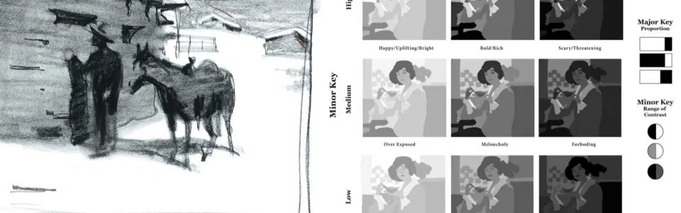
Perkins, B. (2023). Composition for the visual artist live class – current class recordings [Video]. New Masters Academy. https://www.nma.art/videolessons/composition-for-the-visual-artist-live-class-current-class-recordings/
By grouping your darks and lights together into large, clear masses, you create a high-impact, poster-like design. This "graphic" approach ensures the viewer’s eye is immediately pulled toward your focal point before any technical perspective is even applied.
The Perfectly summarize Paul Felix image making process. Kennedy, Mark. "Paul Felix Layout Notes." Temple of the Seven Golden Camels, 30 Nov. 2011, sevencamels.blogspot.com/2011/11/paul-felix-layout-notes.html.
Phase 2: Defining the Viewer/ Camera
Kolesov, S. (2024). Space envelope: Dealing with perspective [Digital video and materials]. Gumroad. https://peleng.gumroad.com/l/SpaceEnvelope
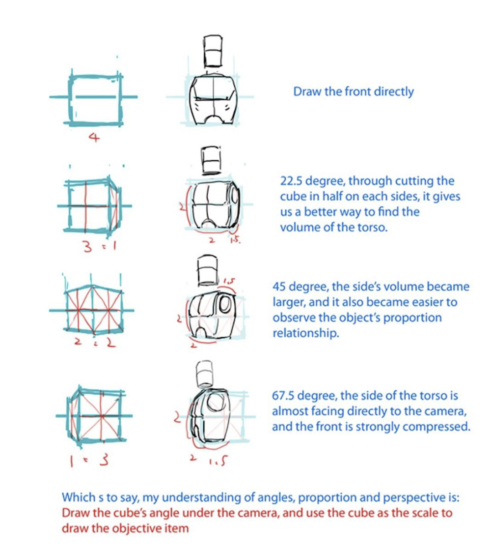
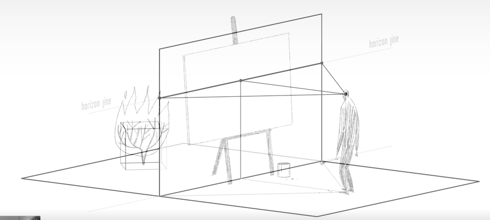
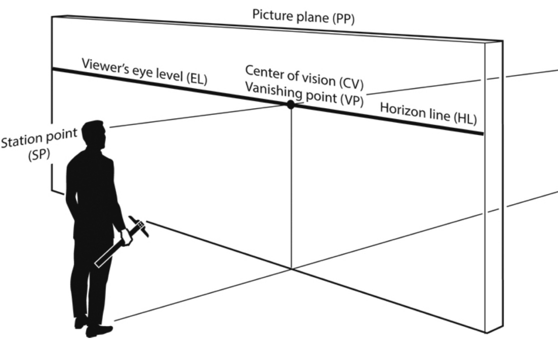
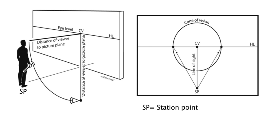
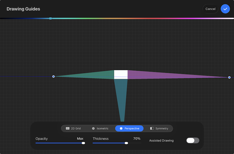
Now you must define the physics of your "camera." Perspective is not about the object you are drawing; it is about where the artist is standing. The Station Point represents your eye's fixed position. If you stand too close to your subject, the drawing will appear distorted and warped.
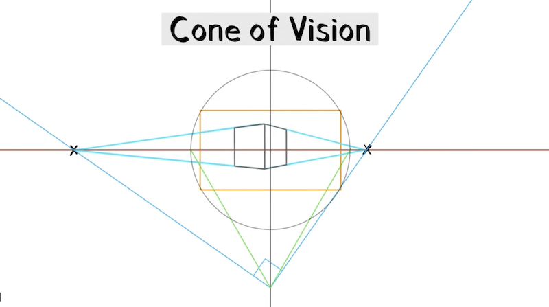
Whitehead, C. (2022, May 22). Vanishing points with the cone of vision [Video]. YouTube. https://www.youtube.com/watch?v=T-21p22lCQE.
To keep the drawing believable, stay within the Cone of Vision, which is a 60-degree field of view radiating from your eye. Any object placed outside this circle will look unnaturally stretched.
Phase 3: The Mathematical Framework
To find your vanishing points scientifically, use the 90-Degree Rule. Imagine a right angle at your Station Point. Where the sides of that angle hit the Horizon Line, that is where your Left and Right Vanishing Points are located. As you rotate your head, these points slide along the horizon, but they always maintain that 90-degree relationship to your eye.
You then use Measuring Points (found by rotating the distance from the vanishing point to the station point up to the horizon) to transfer those real-world measurements into deep space. If you want a box to be exactly 5 inches deep, the Measuring Point tells you exactly where to cut the line.
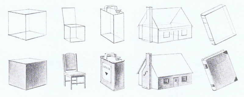
Phase 4: Constructing Volume
Every complex object, from a sports car to a human figure, starts as a simple box.
Famous Artists Schools. Famous Artists Course: Lesson 2, FORM. Famous Artists Schools Inc., 1960.
When drawing organic forms like trees or mountains, do not paint them as flat shapes. Build them as simple volumes like cylinders or spheres on your perspective grid first. This ensures they have weight and occupy real space.
Famous Artists Schools. Famous Artists Course: Lesson 2, FORM. Famous Artists Schools Inc., 1960.
Phase 5: Light and Atmosphere
Finish the drawing by anchoring objects with light physics. For sunlight, shadows follow the standard vanishing points because sun rays are parallel. For artificial light like a lamp, you must drop a vertical line to the floor to find the specific vanishing point for that shadow.
Station Point!
The "Digital Trap" in Drawing Apps
画角ノススメ 電子版 (Gakaku no Susume: Denshi-ban / Recommendation of Field of View: Digital Edition)
If you’ve ever used the perspective rulers in Clip Studio Paint or the guides in Procreate and felt like your drawing looked warped you’re likely confused on where is the most optimal place to place the vanishing point.. These apps allow you to drop vanishing points anywhere, but if you keep them both inside the borders of your canvas, you are effectively telling the viewer that the camera is only inches away from the subject. This creates a frantic, distorted wide-angle look. And when you want to rotate a cube one space that isn’t parallel to other objects, you might get confused on where to place the new vanishing points.
While the common advice is to just "move the vanishing points further apart," it’s rarely explained why that works. And when you want to rotate a cube one space that isn’t parallel to other objects, you might get confused on where to place the new vanishing points. The truth is that the distance between your vanishing points is actually dictated by an invisible third point: the Station Point.
Attebery, C. (2018). The complete guide to perspective drawing: From one-point to six-point. Routledge. https://amzn.to/4pRMHRa
What is ‘em Station Pointy thingyamabob?
In perspective, we tend to obsess over the vanishing points on the horizon, but the most important part of the scene is actually behind the canvas. This is the Station Point, and it represents exactly where you’ve placed your audience.
Attebery, C. (2018). The complete guide to perspective drawing: From one-point to six-point. Routledge. https://amzn.to/4pRMHRa
Think of it as a creative choice: do you want the audience to be in the thick of the action or a bit more removed? When you bring the Station Point closer to the "picture plane" (your canvas), it forces the vanishing points together and creates that wide-angle distortion. By understanding that the Station Point is your physical location in the world, you realize that "moving the points apart" is actually just the act of stepping back to give your subject some breathing room.
This a great example of a wide angle style type of drawing. Kim, D. H. (2017). Space drawing: Perspective. Superani. https://superanius.com/products/dong-ho-kim
The Secret to Rotating Objects
The Station Point isn't just for choosing a view; it’s a tool for construction. One of the hardest things to do in visual development is rotating a vehicle or a prop without it looking like the corners are melting or changing shape. It’s easy to accidentally draw a box with 60-degree corners when they should be a perfect 90 degrees.
This is probably one of the best explanation video on how to rotate a cube based on the station point and cone of vision(Cone of Vision can also be thought of as a tool to how close you are to the subject). The trick is to remember that in a standard setup, the lines connecting your two vanishing points back to your Station Point must form a perfect 90-degree corner. Imagine a carpenter’s square sitting on the floor at your feet. If you want to rotate an object, you simply pivot that 90-degree corner at your Station Point. Wherever those two "arms" hit your horizon line, those are your new, perfectly accurate vanishing points. This takes the guesswork out of the process and ensures your objects stays consistent no matter which way it turns.
Character Line Up
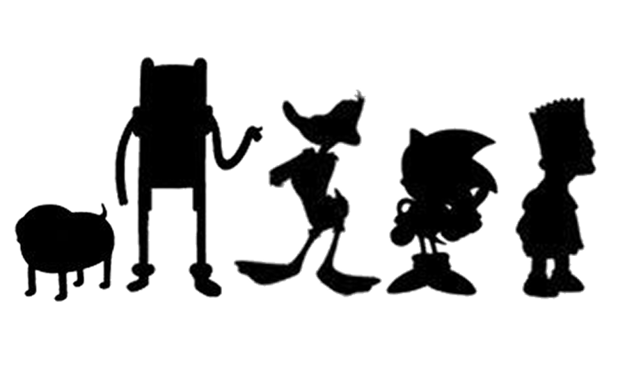
The Foundation of the Silhouette
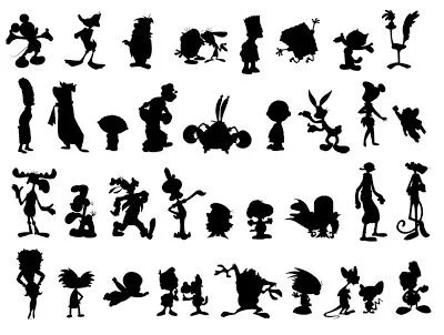
How many of these characters can you recognize?
Designing a professional character cast begins with a commitment to clarity over complexity. The foundation of this entire process is the silhouette. If you strip a character down to a solid black shape and they are no longer recognizable, the design has failed to establish a clear identity. A strong silhouette is the ultimate test of a character's readability. Iconic designs in animation history are famous because they can be identified by their Silhouettes alone. This level of clarity is achieved by avoiding visual clutter and focusing on big, identifiable shapes that define the character's physical presence from a distance.
Psychology of Shape Language
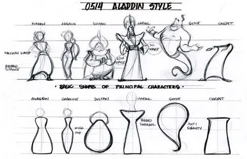
Bill Perkin’s had this pinned up on the wall during the producion of Aladdin.
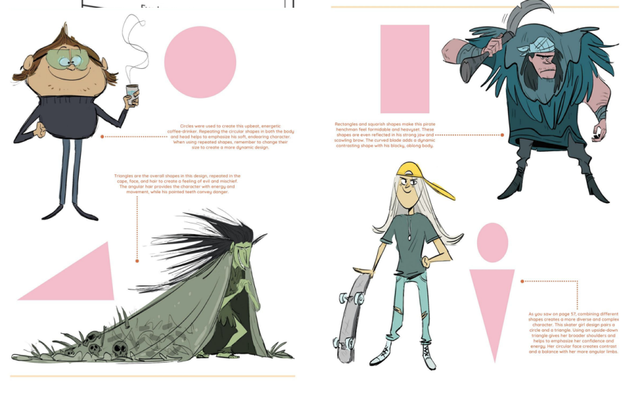
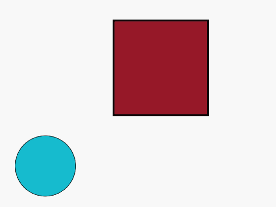
Shape language serves as the psychological DNA within that silhouette. Every primary shape carries a subconscious meaning that tells the audience how to feel about a character before they ever speak. A square suggests stability, reliability, and stubbornness. It is the shape of a character who acts as a literal wall or a protector. A circle feels friendly, soft, and approachable, making it the standard choice for protagonists we are meant to trust. A triangle, with its sharp corners and tapering lines, implies speed, danger, and intensity. By committing to a specific shape motif, you create a visual shorthand that communicates personality with immediate impact.
3dtotal Publishing, editor. Fundamentals of Character Design: How to Create Engaging Characters for Illustration, Animation & Game Design. 3dtotal Publishing, 2020. Section by Stephanie Garcia Rizo https://amzn.to/4jZLqGj
Internal BMS and Utility
3dtotal Publishing, editor. Fundamentals of Character Design: How to Create Engaging Characters for Illustration, Animation & Game Design. 3dtotal Publishing, 2020. Section by Kenneth Anderson https://amzn.to/4jZLqGj
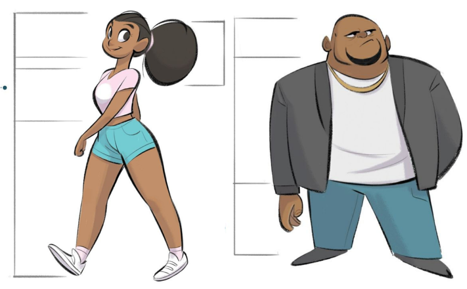
To make these shapes functional, you must apply the core tools of visual hierarchy. These principles act as a map for the eye, ensuring the most important narrative information is processed first. Size and scale are the most immediate of these tools, utilized through the big, medium, and small principle. By making one specific element of a character much larger than the rest, you create an internal anchor. This is particularly effective when applied to the three section method. Making the head the big section highlights intelligence, while making the legs the big section highlights speed. This internal hierarchy tells the viewer exactly what the character's specialty is.
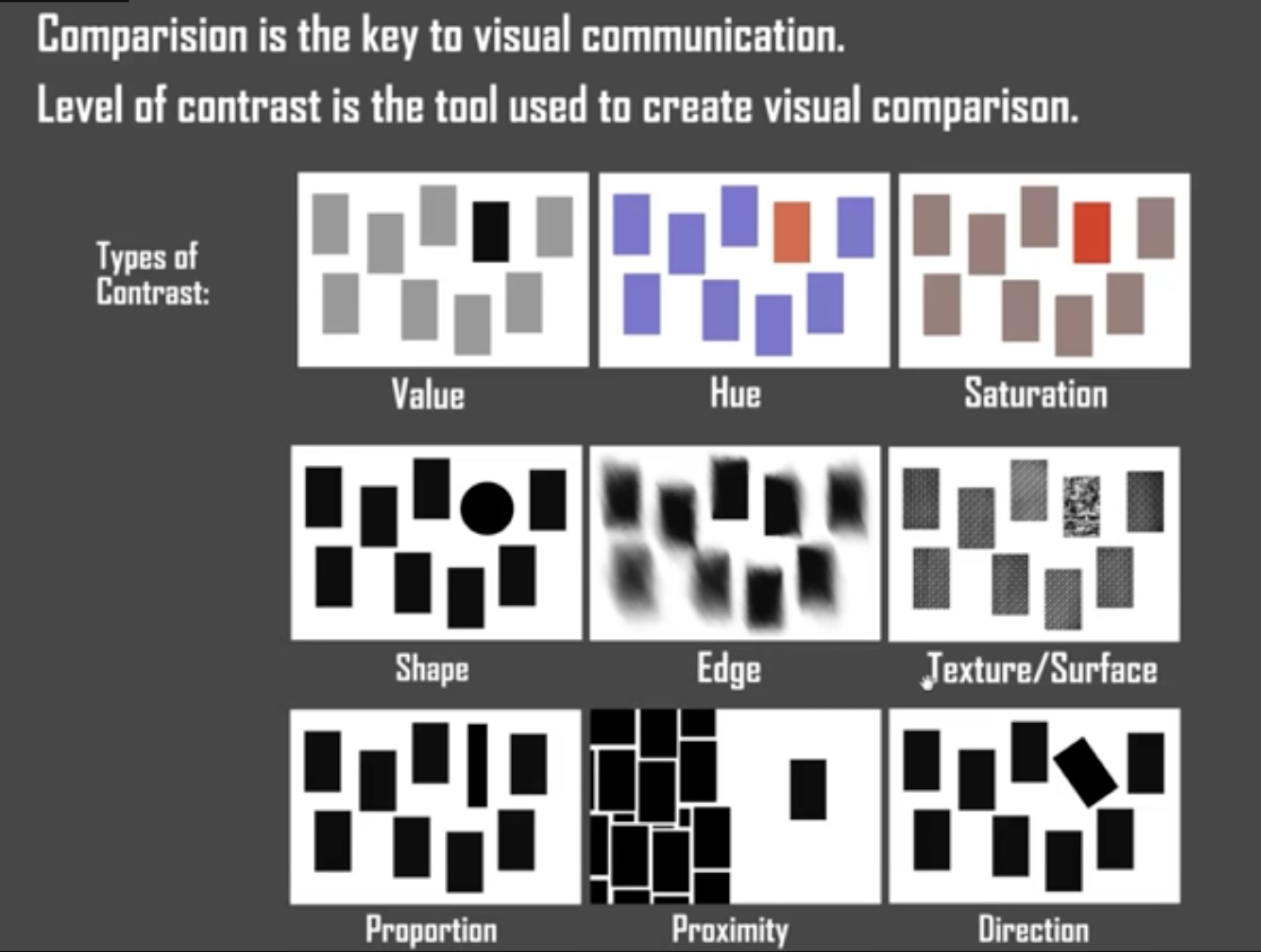
Contrast and Visual Bullseyes
Nielson, S. (n.d.). Fundamentals of lighting [Online course]. Schoolism. https://schoolism.com/courses/concept-art/fundamentals-of-lighting-sam-nielson
Contrast and value further refine this hierarchy by creating a bullseye for the viewer. Hierarchy is established by how much an object stands out from its environment. Placing high contrast areas at the primary point of interest, such as the face or a unique weapon, ensures the eye knows exactly where to land. If every part of the design has the same level of detail and contrast, the viewer experiences visual fatigue. By simplifying the values in secondary areas, you focus the viewer’s attention where it matters most. There are a lot of options available for our tool belt. However, a great place to start is the top 3. Hue, Value, and Saturation.
The Rollercoaster Lineup
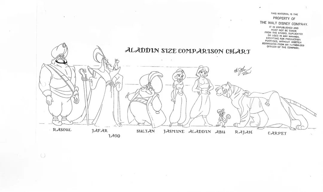
Aladdin Character Lineup.
In a lineup, these tools help create the rollercoaster effect. You want to avoid the boring train track where every character is the same height and width, creating a flat, uninteresting horizontal line. Instead, a successful lineup uses the rollercoaster analogy, where the viewer's eye bounces up and down, traveling from a tall, thin character to a short, wide one. This variety in height and mass prevents the cast from feeling stagnant.
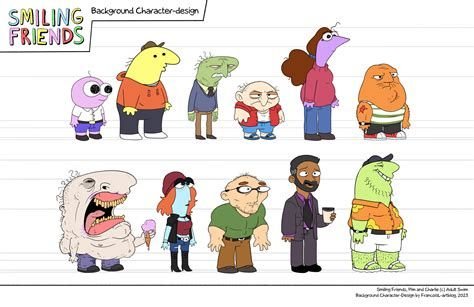
Smiling Friends Background Characters.
Finalizing Uniqueness
Highly recognizable characters
To finalize the uniqueness of each member, you add a signature quirk or a weird shape. This is one specific hook, like a massive hat, a strange hairstyle, or an unusual prop, that belongs only to them. This ensures they stand out in a crowd and gives them a recognizable "brand." This combination of internal structure and group variety ensures a cast that is both memorable and easy to read.
The Magic of the Mark: Drawing is THE Universal Human Language
Drawing is fundamental to being human. I’ve never to meet a child who didn’t instinctively love making marks or drawing. While the barrier to entry is as low as a pencil and a scrap of paper, the actual power of drawing is vast.

A glimpse into the past: The Great Hall of the Bulls in the Lascaux caves, France. Courtesy of Wikimedia Commons. https://en.wikipedia.org/wiki/Lascaux#/media/File:Lascaux_painting.jpg
To understand its potential, look at the cave walls of Lascaux. Those drawings were made thousands of years ago, yet the representation is so clear we can’t help but feel an immediate connection to our ancestors. Drawing is, in many ways, a form of magic. It is the ultimate blueprint for human innovation. Every blueprint for a cathedral, every CAD drawing for a product, and every tangible thought began as a drawing on a page. It is THOUGHT given form before it becomes MATERIAL.
This is where drawing finds its most practical power: it allows us to share the unshareable. When words fail to describe the specific curvature of a car or a complex idea, the drawing speaks. It acts as a universal translator, bypassing language barriers and connecting one mind to another through simple mark making.
The First Element: The Invention of the Line
Alexandre-Charles Guillemot, The Myth of Dibutade or the Invention of Drawing, 1825.
We can’t pinpoint exactly when humans developed the concept of a "line," but history is full of legends about its origin. The Roman author Pliny the Elder tells a story of a potter’s daughter in Corinth. Her lover was leaving for a journey, and she couldn't bear to let him go without capturing his likeness. As lamplight cast his shadow on the wall, she traced the outline, preserving his silhouette in a single, unbroken line.
While we now have evidence of even earlier drawings in caves, the concept remains the same, the line is our most basic tool, yet it possesses infinite possibilities.
The Paradox of the Line
The use of line is intuitive. Give a toddler a crayon, and they’ll instinctively produce scribbles. As we grow, we use these marks to map our understanding of the world. However, there is a curious paradox. In the physical world, lines don’t actually exist. We don’t see black outlines around trees or people. Instead, we perceive edges, where one shape meets another, or where light meets shadow. The line is a uniquely human invention, a system of representation we created to impose order on visual reality.
What a Line Can Do
The Metropolitan Museum o f Art, New York
Van Gogh Museum,
A line is more than just a mark; it is a vehicle for information. It has the power to define edges, distinguishing an object from the space around it. It can direct the eye, creating pathways that lead the viewer’s gaze through a composition. Line also expresses texture, using scratchy or rhythmic marks to suggest surface quality, and it suggests volume by using varying thickness to imply weight, shadow, and depth. It is the foundation upon which all design and forms are built.

Famous Artists Schools. Famous Artists Course: Lesson 3, Composition. Famous Artists Schools Inc., 1960.
Line Quality: The Artist’s Vocabulary
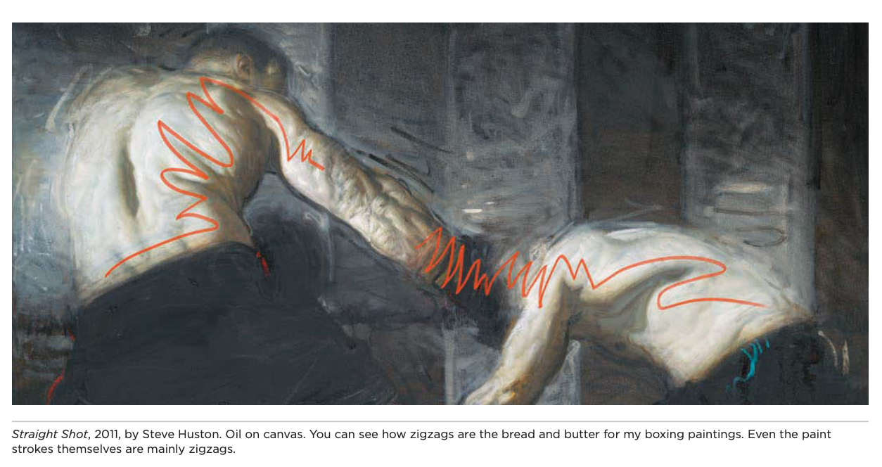
Huston, Steve. Figure Drawing for Artists: Making Every Mark Count. Rockport Publishers, 2016. https://amzn.to/3LKyTdg
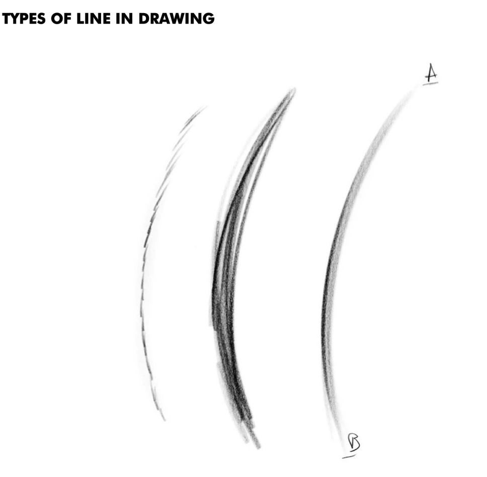
If drawing is a language, line quality is the vocabulary. By manipulating how we draw a line, we change what we communicate. This involves three primary dimensions: path, weight, and edge.
First, consider the path and flow. A confident, continuous line conveys speed and sleekness. These are the silent heroes of a drawing, providing structure without distraction. Straight paths provide stability for architecture, while curved lines offer the organic movement found in living things. Short, sketchy lines often called "hairy lines" when used by beginners can serve a vital purpose for the master, capturing vibration and the softness of a form.
Mattesi, Michael D. FORCE: Dynamic Life Drawing: 10th Anniversary Edition. 3rd ed., CRC Press, 2017. https://amzn.to/49yndU9
Second, we look at weight and value. Line weight refers to thickness, which is a primary tool for creating a visual hierarchy. Thick lines appear to advance toward the viewer and suggest shadow, while thin lines recede. Similarly, shifting from light to dark values allows you to establish atmosphere and lighting without ever using a shading tool.
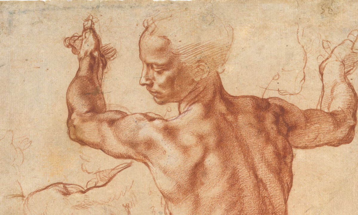
Michelangelo use of varying line weight to capture form and depth! Michelangelo, Studies for the Libyan Sibyl (around 1510-11)Courtesy of the Metropolitan Museum of Art, New York (24.197.2 recto)
Finally, consider the edge and texture. A hard edge provides a crisp, clear boundary, perfect for man made materials and focal points. A soft edge blurs into its surroundings, creating the atmospheric haze needed for skin, clouds, or distant horizons.
Application I: The Discipline of Design
When we focus on design, we are less concerned with realism and more concerned with the arrangement and rhythm of the two dimensional surface. In this discipline, the line is used to manage the flat space of the page.

Even if you don’t appreciate abstract works of art. I think it is important to take a moment and appreciate how these works of art expand our visual vocabulary.
Franz Kline, Untitled, 1957. Oil on canvas, 79 x 112 1/8 inches. Courtesy Mnuchin Gallery. © 2025 The Franz Kline Estate and Artists Rights Society (ARS), New York.
One way this works is through partitioning space. A line does more than describe a subject; it divides the paper into positive and negative spaces. Effective design ensures that the empty negative space is just as visually interesting as the positive shapes. Design also relies on the silhouette to create a clear "read." A strong silhouette allows a viewer to identify an object instantly, even without internal detail. Furthermore, by repeating lines with specific qualities, we create decorative patterns and motifs. This is the basis of textiles and graphic branding, famously seen in the deliberate, rhythmic marks of Van Gogh’s drawings.
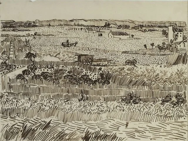
Van Gogh, Vincent. The Harvest (for Émile Bernard). 1888, reed pen and ink on paper, 31.8 x 24.1 cm. Kupferstichkabinett, Berlin.
Application II: The Discipline of Form
If design is about organization, form is about deception. The goal of this application is to trick the human eye into seeing depth, weight, and volume on a surface that is actually flat. Here, the line becomes a structural tool.
Famous Artists Schools. Famous Artists Course: Lesson 2, Form. Famous Artists Schools Inc., 1960.
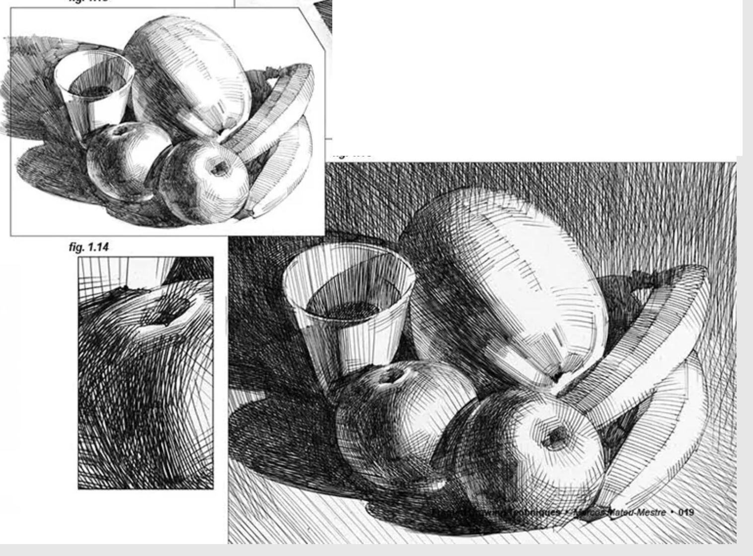
Artists use cross contours, which function like the "ribs" of a drawing. By drawing lines that follow the terrain of an object, like a rubber band wrapped around a cylinder, you define the object's volume. Linear perspective provides the mathematical use of the line, aiming marks toward a vanishing point to mimic how the human eye perceives distance. Finally, form is defined by light through hatching and density. By increasing the number of lines in a specific area, you create value, giving an object the appearance of being hit by a light source.
Mateu-Mestre, Marcos. Framed Drawing Techniques: Mastering Storytelling Through Graphic Design. Design Studio Press, 2019. https://amzn.to/4bfEZNf
Combing the magic!
Even though we should study each part separately, so we can have a deeper understanding of the specifics. The hallmark of a seasoned artist is the ability to satisfy both design and form simultaneously through line economy. As mastery grows, you learn to execute a single, elegant stroke that defines a beautiful, flat design shape while simultaneously utilizing varying line weight to suggest the volume of a form.
Kim Jung Gi Demonstrating how to turn a Simple 2D shape into something with form!
Form, body, structure-- Trial class-From the series【100 Lessons Kim Junggi】https://www.youtube.com/watch?v=ztt22A_takM
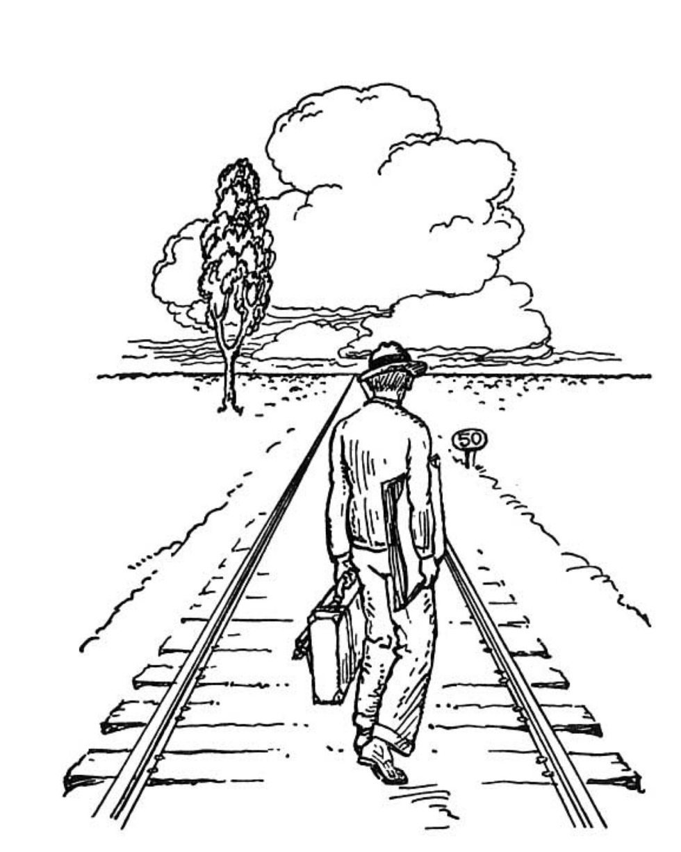
Creating Depth Without Linear Perspective
Ernest Norling, Perspective Made Easy, Dover Publications (1999).https://amzn.to/45nxnV7
Whenever we talk about depth in art, the conversation usually shifts toward railroad tracks and vanishing points. Linear perspective is an awesome, but it can feel rigid and overly technical, sometimes it can be hard to draw what you want with the perspective assist turned on in procreate!
For most of art history, people weren't using rulers or grids. They relied on a set of observational techniques to make a flat page feel like a three-dimensional world. Here are so methods you can look for when creating your composition.
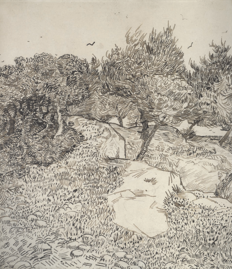
Overlapping
Overlapping to show the square in front.
This is the most fundamental way we perceive space. If one shape covers part of another, the one on top is closer. Think about this in layers. These 2 examples, the shapes are the same size. The difference is just overlapping. If you’re drawing a mountain range, you just tuck one peak behind the other to create an instant "front and back." This works for anything from a landscape to a few objects sitting on a desk.
Now the circle is front with just overlapping.
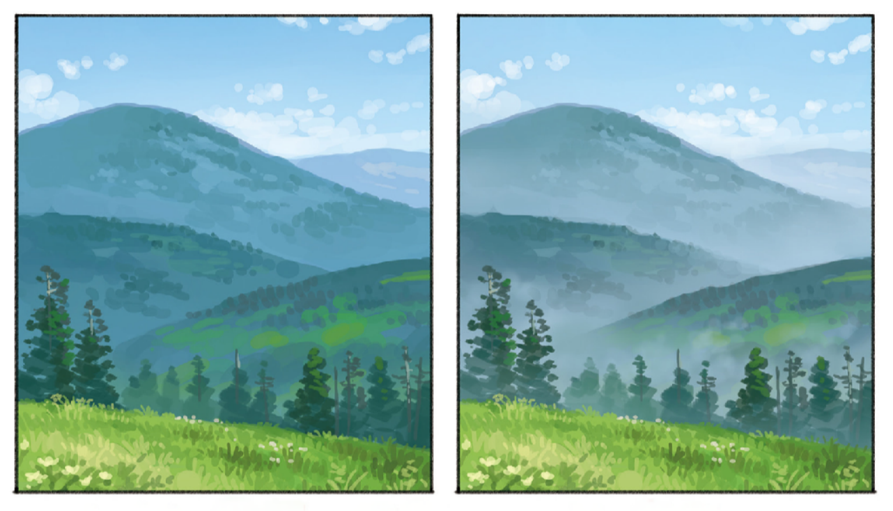
Atmospheric Perspective and Value Contrast
Distant objects look different because of the air between you and the subject. To pull this off, remember that distance reduces contrast.
Seiji Yoshida, Tips to Make You Want to Draw, Pie International (2021)
In the foreground, use your darkest color and brightest color. As things move into the distance, you want to compress those values. Shadows should get lighter and highlights should get darker until everything settles into a mid-tone grey. At the same time, shift your shadow colors toward the atmosphere’s color, like the sky,and let your details blur. Rayleigh scattering is the scientific reason behind atmospheric perspective. It’s the effect of light hitting molecules in the air, which scatters shorter blue wavelengths more than others.
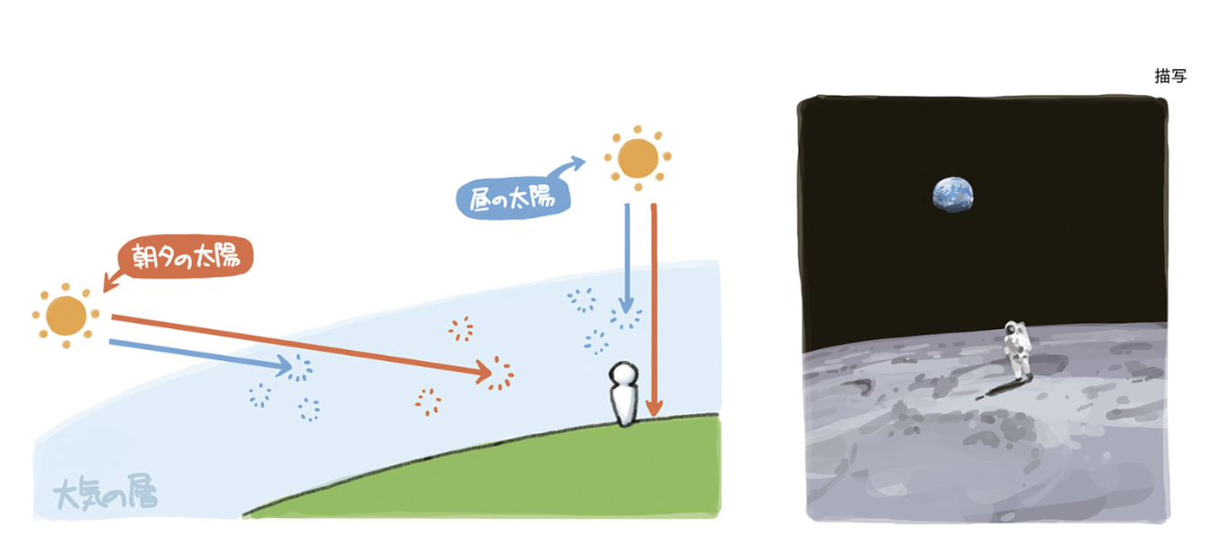
Seiji Yoshida, Tips to Make You Want to Draw, Pie International (2021) This demonstrates the difference between atmosphere on earth vs no atmosphere in space.
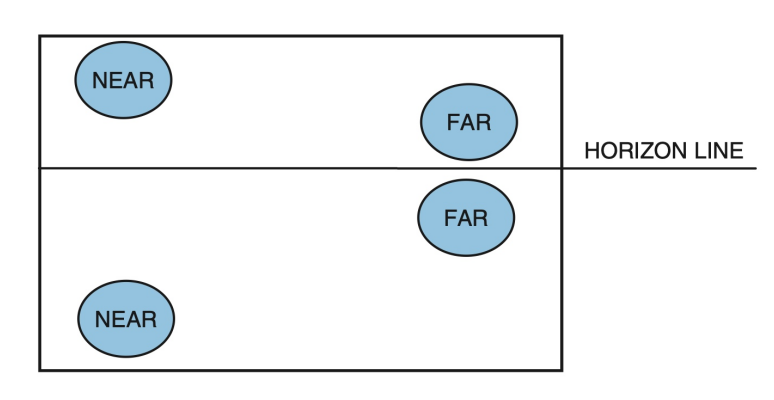
Vertical Placement
The higher something is on the page, the further away it generally looks. Think about standing in a field: the grass at your feet is at the bottom of your vision, while the trees on the horizon are much higher up. Generally speaking, we are prone to feeling like the eye level line is higher on the picture plane, since are eyes are places higher on our bodies. However, The most precise interpretation is that of the digram below.
Bruce Block, The Visual Story, Routledge (2020).https://amzn.to/49vgryp
Relative Scale
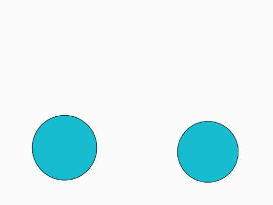
If you draw two similar objects and make one significantly smaller than the other, the brain assumes the smaller one is further away. You don't need a grid for this; you just have to be intentional with your sizing. It’s an effective way to establish a sense of scale or drama very quickly.
Edge Quality
Eternal Sunshine of the Spotless Mind, directed by Michel Gondry (2004). https://amzn.to/464W2hl
Our eyes can’t focus on everything at once. If you’re looking at a primary subject, the background naturally blurs. I save my sharpest, most defined lines for the focal point or the foreground. For everything else, I let the edges get soft or "lost." This creates a natural focus that feels more lifelike than using the same heavy line weight everywhere.
Parallel Projection
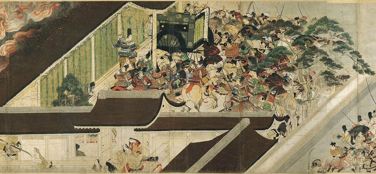
Heiji Monogatari Emaki (Night Attack on the Sanjō Palace), Kamakura period (13th century).
This approach is common in video games and traditional East Asian art. It completely ignores the rule that things get smaller as they recede. Instead, parallel lines stay parallel. Whether it's an isometric view or an oblique sketch, it’s a very clean way to show a room or a building without the "pinched" look of linear perspective.
Combine for Best results
The best results usually come from mixing these techniques. You might have a firm edged object in the foreground overlapping a mountain that is faded into a soft, low-contrast atmospheric blue in the background. It’s often more effective to use these observational tricks to get your composition ready. Sometime, our linear perspective could be correct but feels off still and we can use these techniques to help edit our compositions!
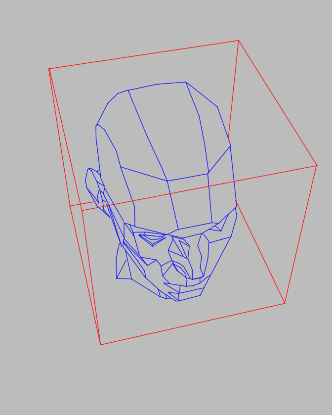
Asaro/Reilly Method
I've been studying the Asaro head for a few years now. Every time I do a study I learn something that is valuable. It's the gift that keeps on giving.
There are two schools of thought when it comes to painting.
First, There's the Richard Schmid idea of painting exactly what you see; Painting every color and shape as you see it. That is great for observation. I have known many artists that can draw and paint from pure observation. Second, it's the analytic artist who needs to be able to comprehend or simplify the shape before they can truly paint it.
I find that I fit more in the latter category, but like most people, nothing is purely binary. Both methods are extremely useful together. That's why I have found the Reilly/Asaro method very useful. Reilly’s method is for gestural relationships on a 2d surface and the Asaro is the concept of a 3-dimensional object.
Reinterpreting and making Asaro work for me.
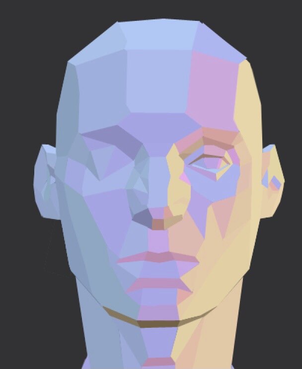
I have incorporated my own personal perspective on studying(pun intended). By placing the box on the Asaro head, I am reminding myself of the 3-dimensional properties of the head. This way I am also playing with the iconography of the 2-dimensional shape and the type of "lens" I am using.


This tool is also incredibly helpful when it comes to painting. In the painting, below I was about to use the polygon tool to make the simple shapes. Of course, the colors are achieved by using outside knowledge of light and color theory. But understanding the planes and rhythms of the head makes a painting from your imagination similar to this so much easier.
The Asaro head may seem stiff but once you know the basic ideas of the form and its proportions, you can use it to exaggerate and play with it.

The Asaro head is one of the best tools that I have ever used to study the head. There are several tutorials out there, paid and unpaid, but none of them are truly complete. Most of the tutorials require extensive outside knowledge to bring to the table.
Other resources
Jack Faragasso’s book is probably the most complete instructions I have found on the web for the Reilly method. It is probably more complete than 99 percent of the tutorials out there. I am pretty glad that they are publishing it again.
Affiliate links
https://amzn.to/4s98eqR
Where to purchase the Asaro head.
Not an Affiliate link.
The Guide that comes with it is very helpful to understanding the Reilly and Asaro method.
https://www.planesofthehead.com/original_head.php
3d models of the Asaro head
https://sketchfab.com/3d-models/asaro-head-9d26548182f8465a8e97371a9170561e
John Asaro’s website
https://johnasaro.com/home.html